Overview
The WordPress Block Supports API offers plenty of features to extend your ACF Blocks. Additional attributes are passed to your block when you opt in to these features. Often, these features enable different parts of the block editor’s user interface and allow your clients to customize corresponding properties like spacing, alignment, or color.
This tutorial shows you how to utilize Block Supports with ACF Blocks to give your clients a consistent and easy-to-use experience for managing block settings and styles. We’ll explore how to add Block Support properties, and then show how to ensure your block’s assigned properties are properly output in the final markup.
This tutorial will modify the custom Author Info block used in previous tutorials. However, you should be able to add the code to any ACF Block and obtain similar results. You can download the current version of the Author Info block here: author-info-block-v2.zip
Be sure to check out the previous tutorials:
Declaring Block Supports in ACF Blocks
The entry point for declaring your Block Supports is your ACF Blocks block.json. Let’s look at a simple ACF Block example:
{
    "name": "acf/author-info",
    "title": "Author Info",
    "description": "Display an author's info and picture.",
    "icon": "id",
    "acf": {
        "mode": "preview",
        "renderTemplate": "template.php"
    },
    "supports": {
        "align": true,
        "html": false,
        "jsx": true,
        "mode": true
    }
}
Most of the block.json example above should already look familiar. The "supports" key is where we want to focus. Here, we’re declaring our support for certain features. Two features are unique to ACF Blocks and not part of WordPress: jsx and mode.
jsx: JSX refers to how ACF renders your block. This property is true by default in ACF Blocks v2, and is required to use features like<InnerBlocks />and will be required for upcoming features. When enabled, ACF processes your rendered PHP template in JavaScript first, allowing the use of React implemented features.mode: Adding support formodeallows users to toggle between edit and preview modes via a button. This property defaults totrue.
By declaring "align": true, we’re enabling our clients to set this block’s alignment to center, left, right, full, or wide.
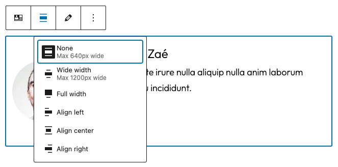
We can limit the options for alignment by passing in specific attributes.
...
"supports": {
    // Declare support for specific alignment options.
    "align": ["left", "right", "full" ]
}
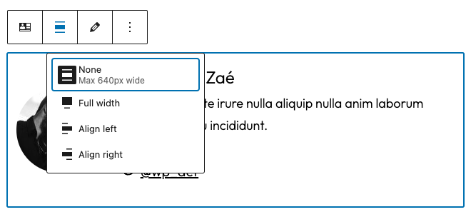
You can go even further, using the attributes key to pass a default value for many Block Supports.
...
"supports": {
    // Enable all alignment options.
    "align": true
},
"attributes": {
    "align": {
        "type": "string",
        "default": "right"
    }
}
Whenever a client adds this block to the editor, it will automatically be aligned right.
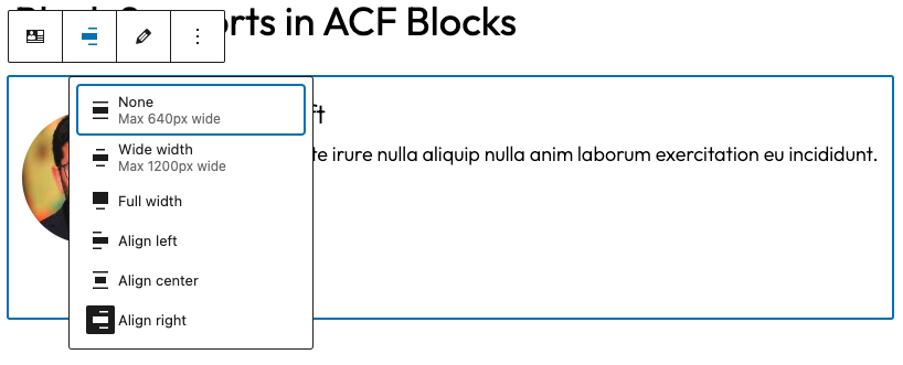
Alternatively, you can disable the alignment controls and still force a non-default alignment attribute. Set "align": false, and then pass in an attribute with a new default alignment:
...
"supports": {
    // Disable alignment controls.
    "align": false
},
"attributes": {
    "align": {
        "type": "string",
        "default": "wide"
    }
}
Spacing is another Block Support attribute that we can explore as an example. Spacing can include margin, padding, and blockGap, and each exists as sub-properties of spacing.
...
"supports": {
    "spacing": {
        "margin": true, // Enable margin UI control.
        "padding": true, // Enable padding UI control.
        "blockGap": true // Enables block spacing UI control for blocks that use layout.
    }
}
The example above enables all three spacing properties. Of course, we can be more specific on what we want to allow.
...
"supports": {
    "spacing": {
        "margin": ["bottom", "top"], // Enable margin for arbitrary sides.
        "padding": true, // Enable padding for all sides.
        "blockGap": ["horizontal", "vertical"] // Enables axial (column/row) block spacing controls.
    }
}
Again, we can also provide default values for specific properties that we support with the attributes definition. When we opt into specific spacing properties, the definition of the attributes includes the style attribute.
...
"supports": {
    "spacing": {
        "margin": ["bottom", "top"], // Enable margin for arbitrary sides.
        "padding": true, // Enable padding for all sides.
        "blockGap": ["horizontal", "vertical"] // Enables axial (column/row) block spacing controls.
    }
},
"attributes": {
    "style": {
        "type": "object",
        "default": {
            "spacing": {
                "margin": {
                   "bottom": "2rem",
                    "top": "2rem"
                },
                "padding": "2rem" // Assign default value for all sides
            }
        }
    }
}
Above, we’re opting into specific spacing properties in our "supports" definition. In our "attributes" definition, we’re passing default values to each of our properties. There are a lot of Block Support properties, and we encourage you to experiment with them to turn key features of your ACF Blocks on or off. If you use ACF Blocks v2 and define your blocks with block.json, any new supports added by WordPress in future versions are likely to work without any other changes.
Also, remember that declaring support in your block.json will not automatically apply the final properties to your final saved block markup. Once your blocks have attributes assigned, you will want to apply them programmatically to your blocks. We’ll cover how to do this next.
Applying Block Supports to ACF Blocks
Defining Block Support in your ACF Block’s block.json file was the first step. Next, we need to ensure all of the properties our block supports can be output in the final block markup.
This is where the convenience of ACF PRO’s "renderTemplate" definition comes in handy.
In your block.json, you can pass the PHP file you want to call for your block’s template:
"acf": {
    "renderTemplate": "template.php"
}
Once we step into our template.php, we’re passed in several helpful parameters to utilize:
$block– (array) The block’s attributes.$content– (string) The block’s content as a parse string.$is_preview– (boolean) Check whether or not the block is currently in the editing view.$post_id– (int) The current post being edited or viewed.$wp_block– (WP_Block) The block instance.$context– (array) Any block context information.
WordPress provides us with the handy get_block_wrapper_attributes() function, which we can use to assign our attributes. However, we must be mindful to not try and use this function when ACF Blocks are in preview in the editor, as your blocks will automatically get a wrapper provided by the block editor which could duplicate your attributes. We can use $is_preview to check when we’re in preview mode and avoid confusion.
Let’s look at a specific example. Here is our ACF Block’s block.json definition:
{
    "name": "acf/author-info",
    "title": "Author Info",
    "description": "Display an author's info and picture.",
    "icon": "id",
    "acf": {
        "mode": "preview",
        "renderTemplate": "template.php"
    },
    "attributes": {
        "style": {
            "type": "object",
            "default": {
                "spacing": {
                    "margin": {
                        "bottom": "2rem",
                        "top": "2rem"
                    },
                    "padding": "1rem"
                }
            }
        }
    },
    "supports": {
        "color": true,
        "multiple": false,
        "spacing": {
            "margin": ["bottom", "top"],
            "padding": true
        }
    }
}
Enabling "color": true automatically opts us into some of color’s sub-properties, like "background" and "text". These will allow editors to choose a background color and text color.
We’re passing in a new definition for "multiple": false, which makes sure that this block can only be inserted once in the editor. If an editor tried to insert another copy of our block in the same post, then they would see a grayed-out version of the block in the inserter.
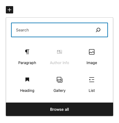
Finally, we’re passing in some "spacing" definitions and setting default values for the desired margin and padding in our "attributes".
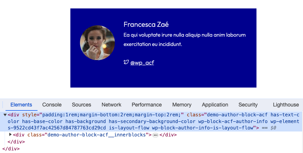
When we want to output all this for the final markup and leverage the convenience of get_block_wrapper_attributes() in our "renderTemplate": "template.php" file, we would put:
<?php if ( ! $is_preview ) { ?>
    <div <?php echo wp_kses_data( get_block_wrapper_attributes() ); ?>>
<?php } ?>

    // Block content goes here.

<?php if ( ! $is_preview ) { ?>
    </div>
<?php } ?>
When our editors leverage any of the customization options, they’ll be output in the final markup. It may be a class or style that is output, depending on which features we allow.
Tips for Block Supports and ACF Blocks
There are some special tips to keep in mind when working with Block Supports and ACF Blocks.
Adding, modifying, or removing an attribute from an existing block’s block.json definition will not update the blocks that have already been inserted in your content. It will only impact future versions of the block, including if a user modifies an existing block entry. This is a limitation of how blocks work in WordPress.
ACF Blocks automatically passes a few default Block Supports behind the scenes:
array (
    'align' => true, // Enables alignment
    'html'  => false, // Disables individual block editing in HTML view
    'mode'  => true,
    'jsx'   => true, // Allows ACF to parse JSX to HTML for InnerBlocks
)
This is really just the beginning of what you can do with Block Supports. Some more helpful Block Supports that we want to point out:
- inserter (
boolean, default:true)
By default, all blocks will appear in the inserter, block transforms menu, Style Book, etc. To hide a block from all parts of the user interface so that it can only be inserted programmatically, set inserter to false.
{
…
    "supports": {
        // Hides this block from the inserter.
        "inserter": false
    }
}
- reusable (
boolean, default:true)
By default, all blocks can be converted to reusable blocks, but you may want to disable this ability for certain blocks. If "supports": reusable is set to false, the option to convert the block into a reusable block will not appear.
{
…
    "supports": {
        // Do not allow the block to be converted into a reusable block.
        "reusable": false
    }
}
We’re still just scratching the surface, and WordPress offers a great deal of flexibility for styling and controlling your ACF Blocks with Block Supports. Be sure to check out the full list of Block Supports for more features you can add to your ACF Blocks.
Supercharge Your Website With Premium Features Using ACF PRO
Speed up your workflow and unlock features to better develop websites using ACF Blocks and Options Pages, with the Flexible Content, Repeater, Clone, Gallery Fields & More.
Related
- ACF Blocks: ACF Blocks: Using InnerBlocks and Parent/Child Relationships
- ACF Blocks: ACF Blocks: How to Use Block Locking
- ACF Blocks: Key Concepts
- ACF Blocks: Using Context With ACF Blocks
- ACF Blocks: ACF Blocks Configuration via block.json

